Guest House Design Plans | Cozy Modern Retreat
Welcome to week two of the One Room Challenge! Today I’m sharing all the details for my guest house design plans. I’m taking this space from a rustic cabin to a cozy modern retreat.
If you’re just joining me, make sure to head back to week one where I showed you all the before photos of our guest house. And be sure to peruse all the participants of this year’s One Room Challenge here.

Post may contain affiliate links for your convenience.
Guest House Design Plans
As you could probably tell from the before photos of our guest house, it was initially designed as a rustic cabin with knotty pine on almost every surface. The walls, the bathroom ceiling, the stair treads, the bathroom and kitchen cabinets, and even the mantel. It was knotty pine overload!
My goal during this guest house remodel is to transform it into a cozy modern retreat. I love the texture the pine adds to the walls, so I knew that I didn’t want to remove it. Instead, painting it a soft taupe would brighten up the space and be the perfect backdrop for the rest of the design to pop.
Design Inspiration
When I design spaces, I like to look for foundational architectural elements before anything else. This sets the stage for a remodel to feel more timeless and gives room to accommodate style changes in the future.
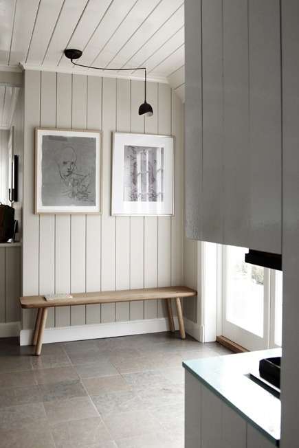
This beautiful soft color on vertical tongue and groove was my starting point for my design. I ultimately chose Soft Secret for my walls by Behr.
With the wall color decided on, I went next to the ceiling. Decorative ceiling beams have been on my bucket list for years. So, this small space feels like the perfect opportunity to get my feet wet.
I plan to do a combination of contractor hire and DIY on the beams to save some money while making sure they look professional. Stay tuned for that project!
My good friends from Joinery & Design Co. inspired my plans to add ceiling beams. I love how the horizontal beams draw your eye down the room.
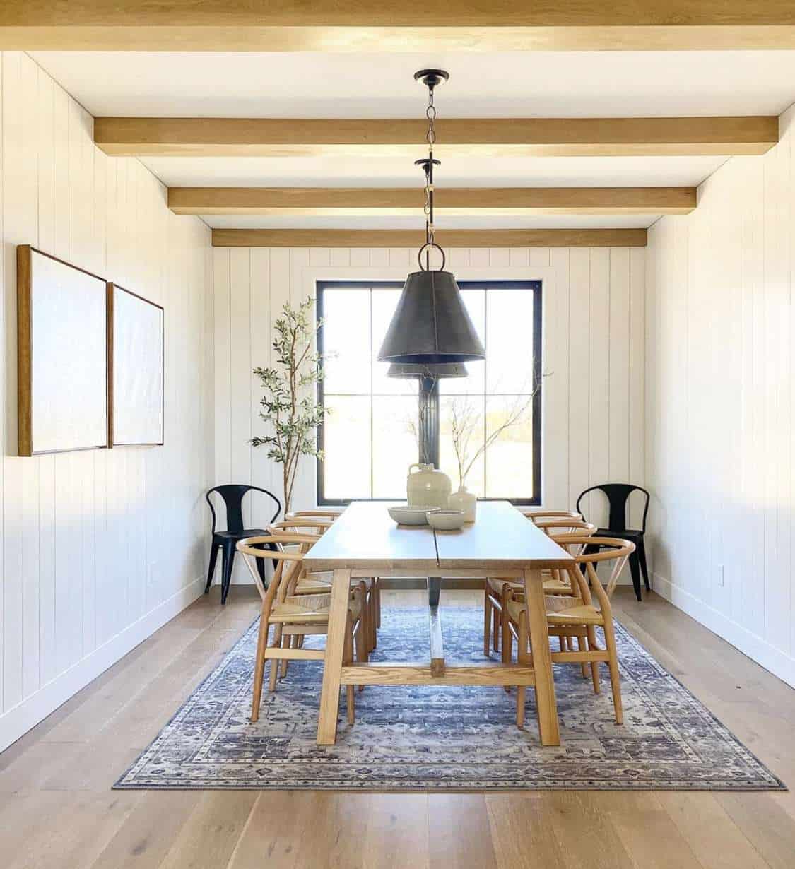
These two changes to the room will set the stage for a timeless design I can elevate with decor. There are so many talented people who I’ve been inspired by throughout the years, but this space from Whitney Utesch is a wonderful combination of cozy, vintage and modern.
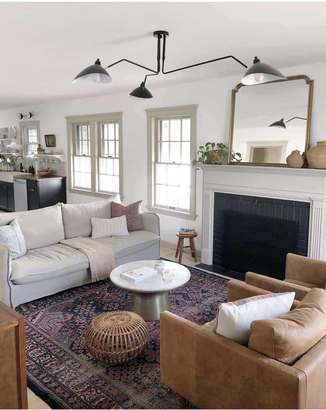
I plan to modernize our guest house with sleek, modern furniture while accessorizing it with vintage finds that add character and coziness.
Guest House Plans
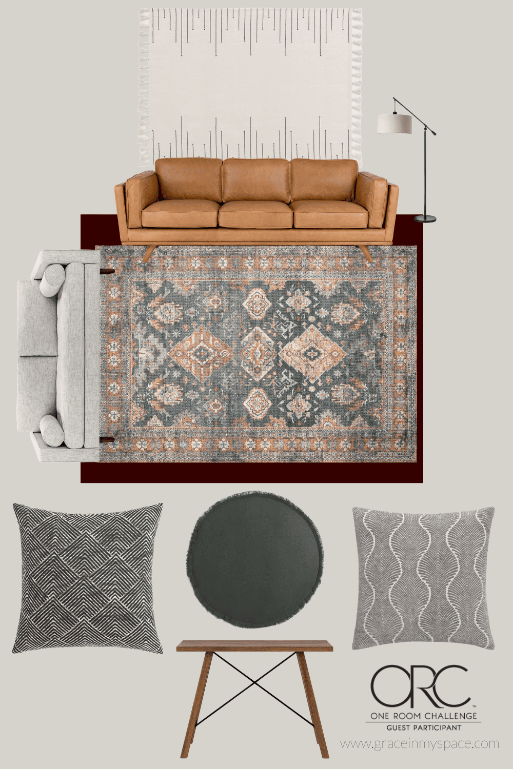
Now on to the details! Here is a visual mood board for reference.
Remember, I had a few items that I had to work around due to budget. The first being these red-hued concrete floors.
A large part of budget renovations is knowing your limits and establishing realistic timeframes and goals. Eventually, those floors will be replaced! However, for now they will have to do.
To be honest, I was going to attempt a DIY on the floors specifically for this project. They “messed with my design”! But then I realized that it may be more helpful to others to see me work around something I don’t love.
Creating a haven takes time and sometimes the design decision that makes the most sense in the long term is to simply be patient and wait.
The Design Details
Let’s break down this visual for those who like the details.
- Paint Color: Soft Secret by Behr
- Couches: Gifted by Article
- Rug: Loloi II Skye Collection Gifted by Loloi
- Additional decor linked via images below.
More details will come on the decor elements in the coming posts! Make sure to subscribe to the blog to stay up to date on all the projects I’ll be tackling in our guest house.
Guest House Design Plans Mock Up
To get a better feel for the space, let’s take a look at these mock ups. Disregard the colors and patterns. They are close, but not exact. These design plans are simply for layout and spacing!

I love using a 3D rendering of the space to get a feel for layout and flow. This rendering is from Planner 5D and it helped me visualize the breakdown of the living area and dining space.
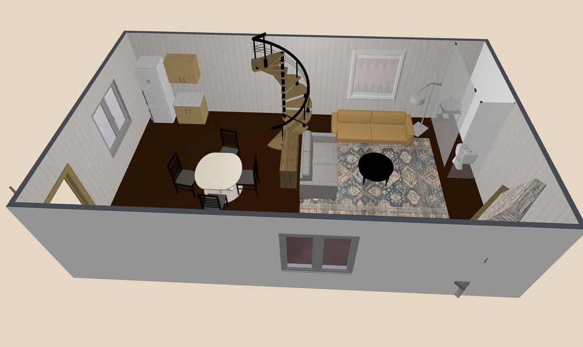
You can also see the partitioned portion where the bathroom exists. I have plans to update that space as well since the sliding door is typically open and it is visible from the entire room.

This is a 500 sq ft space that is entirely open. For that reason, the design needs to be cohesive for each zone of the room while still being distinguishable and different.
The one visual I didn’t capture in my renderings is the ceiling beams. But I have a feeling they will be worth the wait to see in real life!

Seeing the side by side of 3D and 2D renderings is always fun too. I love how the 3D from Planner 5D brings it to life!
Guest House Project List
Let’s wrap up with a quick recap of what this project entails. Over the next 6 weeks I’ll be sharing all of these projects with you on Instagram and the blog!
- Paint Throughout
- Refinish Fireplace Mantel
- Budget Bathroom Makeover (Including “new” countertop!)
- Resurface Kitchen Countertop
- DIY Coffee Table (already complete and linked here)
- Budget Dining Table Makeover
- How to Hide a Wall Heater (fingers crossed this works!)
- Furniture & Decor
Planner 5D – Floor plans and interior design
Make sure to follow along to see how the fireplace turns out next week!
Stay Connected
Thanks so much for stopping by the blog today! I hope these guest house design plans get you excited for the remainder of this project!
One Room Challenge Update
The project is complete! If you missed the 8 week process, catch up with the links below!
- Week 1: Guest House Before Photos
- Week 2: Guest House Design Plans
- Week 3: Mantel Update
- Week 4: How to Hide a Mini Split
- Week 5: Bathroom Remodel for $300
- Weeks 6 & 7: DIY Ceiling Beams
- Week 8: The Big Reveal


This is going to turn out really great!
Thank you so much!
I love all of your inspiration and plans for this space Sarah! Can’t wait to see the finished product!
Thank you Stephanie! It’s coming along!
Such a beautiful design Sarah! Love the sofas and rug. I’m working with some aspects of my room that I cannot change either, and I think it adds to the challenge. Can’t wait to see it come together!
It definitely does add to the challenge! I love that you are working with it too.
What a cool bonus space to have!! I love that color choice for the walls!! Excited to follow along!
Thank you my friend!