Designing a Modern Farmhouse Kitchen with a Black Farmhouse Sink
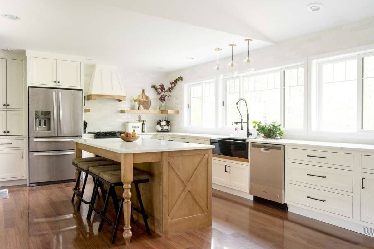
I’m so excited to finally have my first post up revealing my new kitchen! If you love the modern farmhouse design style, then this post is for you. Here are tips for how to use a black farmhouse sink to anchor your kitchen remodel design. Plus, how to mix finishes for a cohesive and sleek look!
This post is sponsored by Signature Hardware. All thoughts and opinions are my own. Post may contain affiliate links where I earn a small commission on your purchases at no additional cost to you.
Modern Farmhouse Kitchen Design
I’ve finally been blessed with the opportunity to design my dream kitchen. In our previous home the kitchen was my favorite space to design; however, I had quite a few limitations I had to adhere to.
So, while it was an absolutely beautiful and functional kitchen, it didn’t have all the design elements I originally wanted. However, one element it did have is a black sink, which you will see is what I centered my design around in our new kitchen once again.
This time around, I planned the kitchen details to be exactly what I wanted in an achievable manner. You can see my entire kitchen design plan in this post (where you can also see what this kitchen looked like before). That is where it all began!
Black Farmhouse Sink
My anchor piece for my kitchen remodel is this gorgeous fireclay farmhouse sink from Signature Hardware. I chose this sink for three reasons.
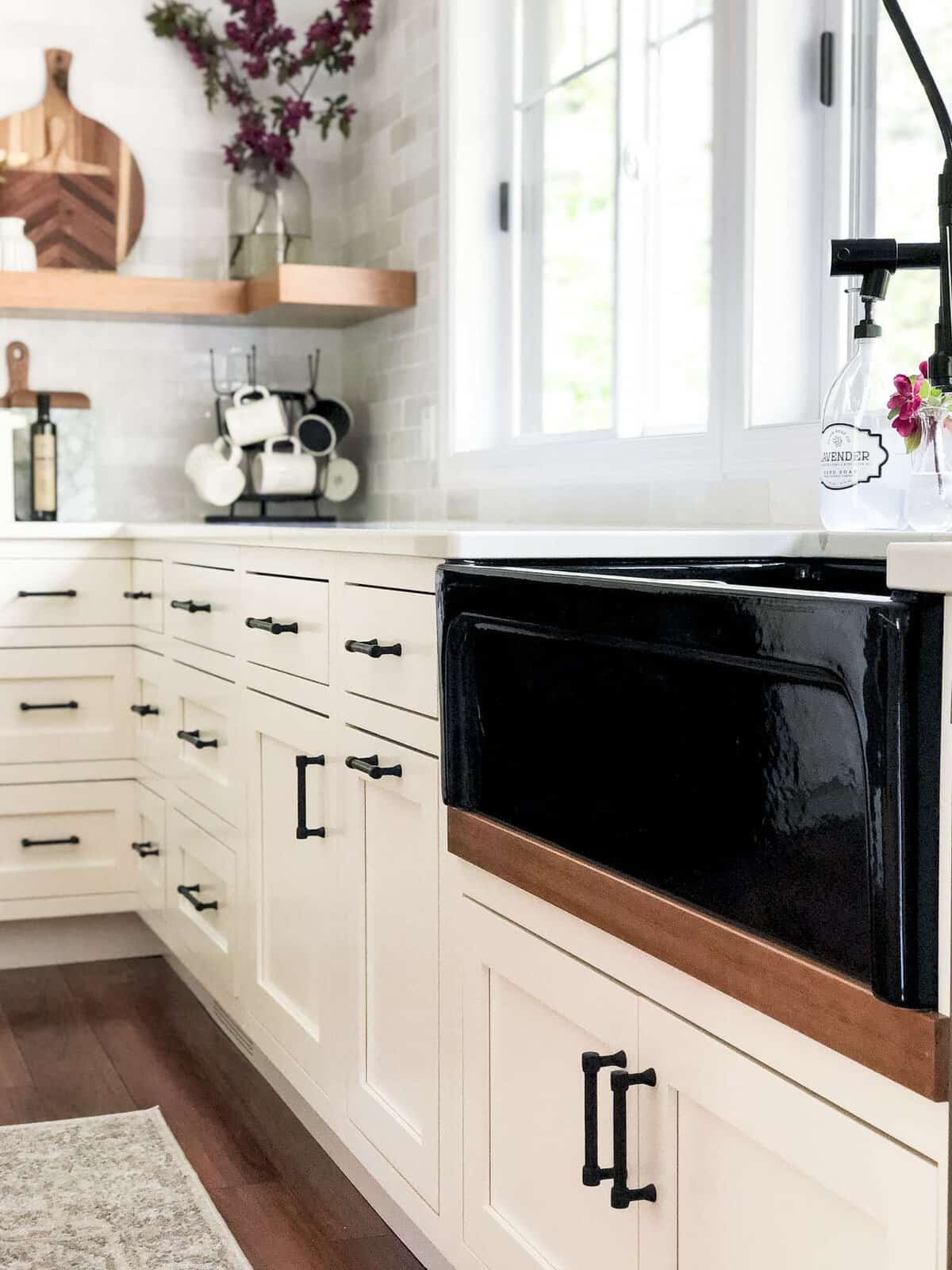
- A black sink is easier to keep clean than white sinks. (White linked)
- The apron front sink offers high design and functionality simultaneously.
- A fireclay farmhouse sink is durable, extra deep and easy to maintain.
Not only that, but it is stunning. I love the casement front that adds a fun design element. Conversely, if you want a clean and more modern look, this sink is also reversible for a smooth apron front.
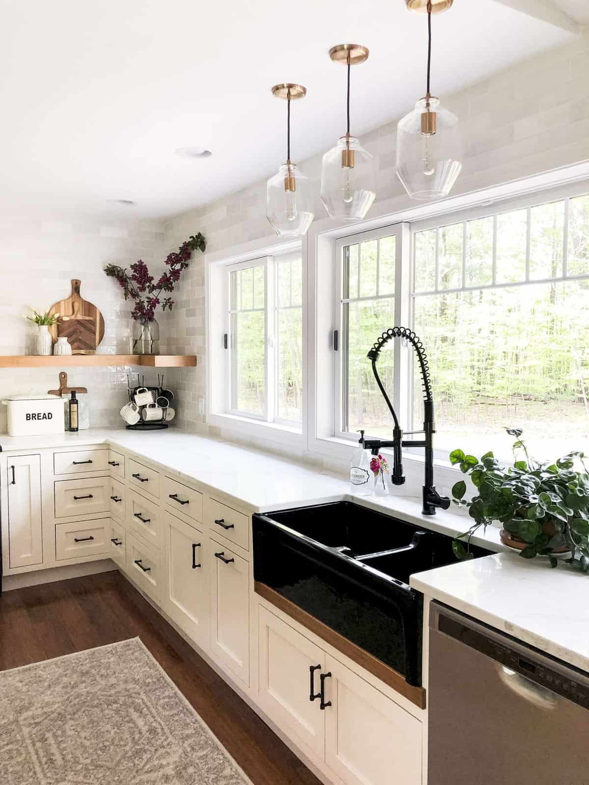
I chose my black farmhouse sink as my anchor for the entire modern farmhouse kitchen design because it is the embodiment of modern farmhouse! It has a farmhouse sink functionality coupled with the sleekness of modern design style.
The black color also gives the kitchen an anchor point since it was placed at the center of the room. The striking design draws your eye to it immediately, and I love that!
{Pendant Lighting can be found here}
Mixing Finishes for a Monochrome Design
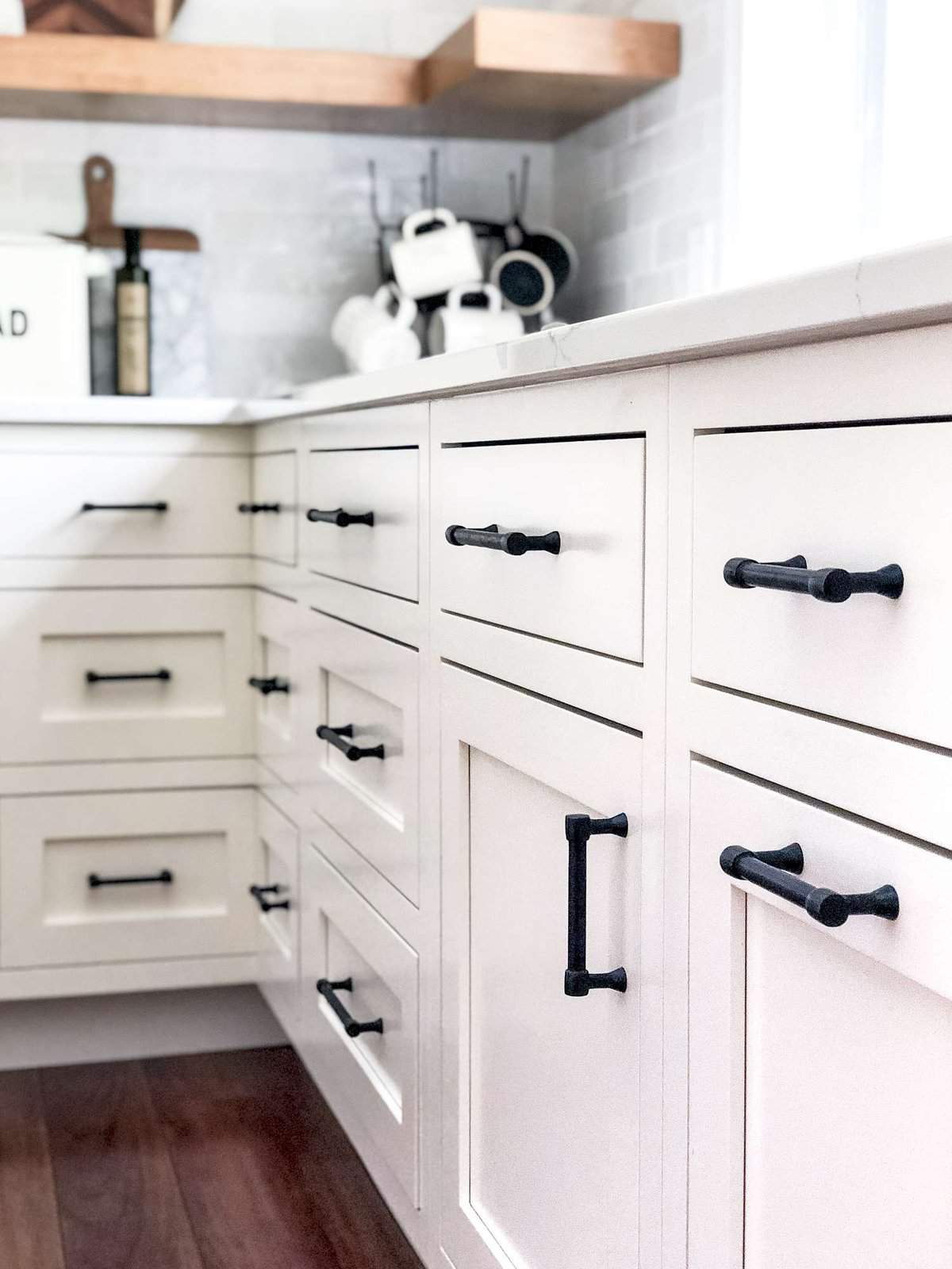
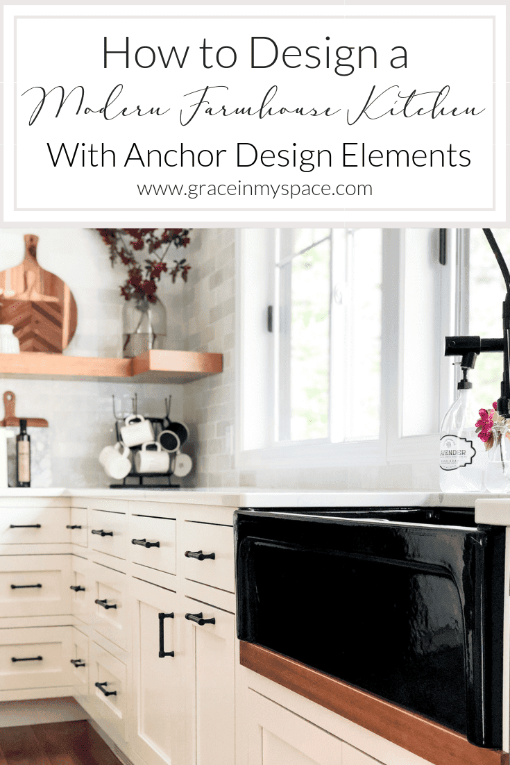
The second area I wanted to touch on in my kitchen design is how I mixed finishes on my hardware! Originally, I had considered using brass pulls on my cabinetry. However, I ended up choosing these beautiful pulls in dark bronze to keep my design monochrome. I also loved that they came in three sizes so I could customize how long the pull is for each drawer size!
Additionally, I chose the Levi spring spout faucet in black. I love this faucet because it has so many options. You can choose to spray and have the spout running at the same time. You can regulate the water flow directly from the spout or by the handle. And you have the option to swing both the arm and the sprayer wherever they are needed.
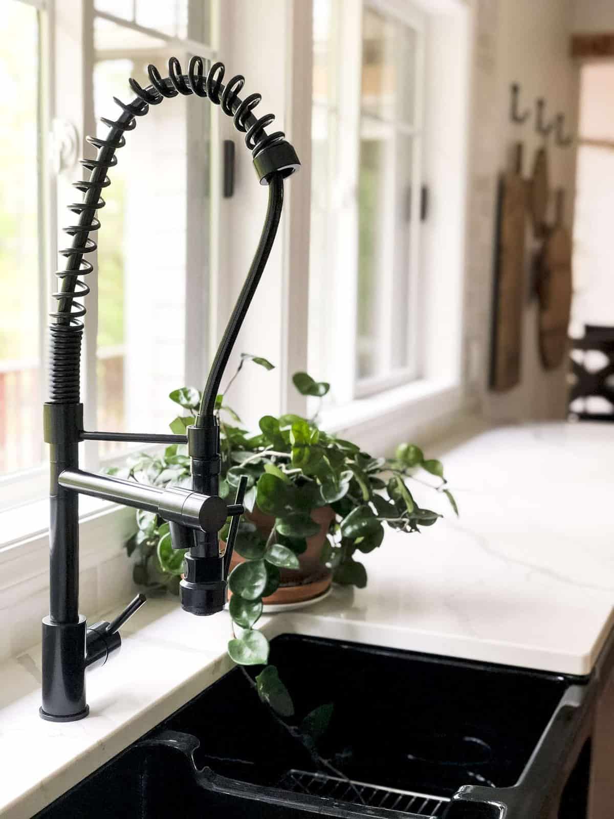
Now that I’ve given you the pros of these beauties, this is why I chose them! Simplifying my kitchen design elements to include black, white and wood was my top priority. It is the epitome of modern farmhouse style, but more importantly, it is just what I love!
I talk about the importance of designing from your heart versus following trends in my book, Designing a Life: From House to Haven. That was so important to me in this design process. Keeping the design simple with three basic, but classic, colors allows me to add interesting elements with decor.
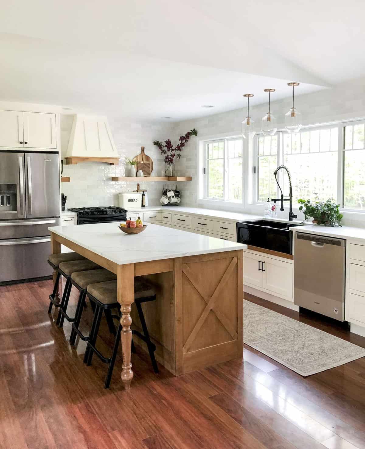
As you can see, black was a staple in my design. However, all of my black elements have a different finish! My black farmhouse sink is high gloss. The beautiful dark bronze pulls have a rustic finish to them. And my industrially designed faucet is a matte finish.
This allows each of these elements to remain interesting instead of being bland and basic.
Pro Tip: Don’t be afraid to mix the finishes within the same color family to add interest and personality to your design.
Sarah Symonds…aka, ME 😉
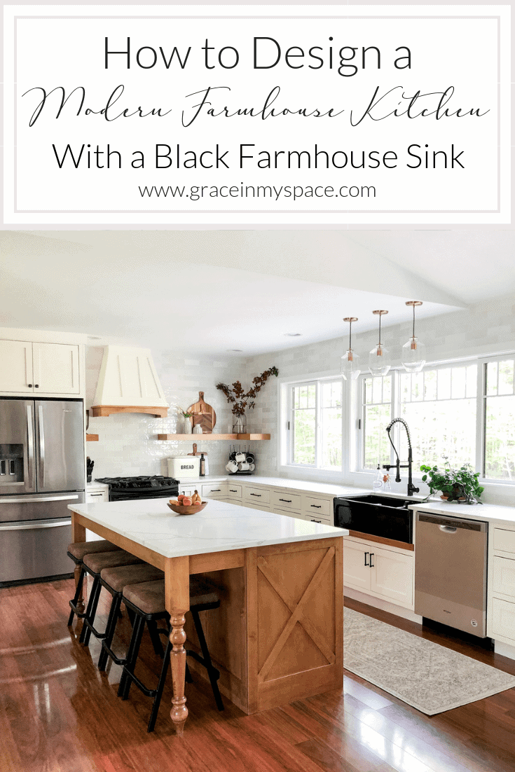
I want to give a huge thank you to Signature Hardware for partnering with me on my kitchen design! The elements I chose to incorporate into my kitchen from this amazing company absolutely make the space!
This was such a fun project to design. I’ve determined that if I could design kitchens full time I would be in a little bit of heaven. 🙂 Thankfully, I now get to enjoy this one as my own! I can’t wait to share more of the details with you in upcoming posts! Stay tuned and subscribe to be notified of project updates!
Thanks for being here my friends,



Your kitchen is beautiful!! Can you share a link for your stools? Do you still love your sink? Thank you!!
Hi Sarah,
Beautiful kitchen! I was trying to find the thickness of your countertop -would that be 2cm?
Thanks in advance 🙂
Sandra
Love your design! What is the make/ model / color of your refrigerator?
Thanks!
Dawn
Thank you! It is a samsung in tuscan stainless steel.
What is the color and name of the backsplash tile. I love it!
It is called Cloe White by Bedrosians! Here’s a direct link! https://rstyle.me/+7-W0lrFQCgUcxX789aMDOw
Hi Sarah,
I stumbled across your blog as I was searching for a marble alternative for our kitchen renovation. I know it was divine intervention! I am also a follower of Jesus who loves design and creating beautiful places to gather, love and serve the Lord. Your kitchen (and house) is stunning! Thank you for providing such a beautiful place for inspiration.
I couldn’t find any information about your kitchen backsplash tile (but may have missed it!). Can you tell me more about it? It looks warmer than some of the carrera options and I love that it is subway tile. I live in an 1890’s era New England colonial farmhouse. My cabinets will be a creamy white and our island will be a deep blue.
God bless,
Dawn
Thank you so much for your kind words! I’m so glad you found me! Yes, our kitchen backsplash is my favorite!! Our tile is by Bedrosians Tile and it’s called Cloe White. Each tile has a subtle color variation which gives it that warmth and interest rather than all one color tile. It looks handmade and I love it! Best of luck in your updates!
Would love to know where you purchased your pendants!
You can find them here! http://shrsl.com/203az
I think my favorite thing about this kitchen is that it is very different from typical farmhouse, modern and contemporary kitchens that I’ve seen time and time again! You really took it and put a spin to it – a spin that works well! I have never seen a black sink like yours but I love the way it pulls the kitchen together. I can’t get over the beautiful design on your island legs with the simple stools – great pairing there as well! I especially like how you design based on yourself, rather than trends that you find online. When you hire a professional cabinet painting company rather than replacing your cabinets altogether, you really can save a lot of money, leaving room for other updates in your space like lighting, faucets, backsplash, etc.
I am loving your beautiful new sink! All the details are gorgeous but that sink is my favorite!
Thank you Libbie! It has been a dream to use too!
Getting ready to start a kitchen remodel and yours is my new inspiration. I want timeless not trendy and you absolutely accomplished that! Just love it!!
Thank you Jaclyn! I’m so glad it can give you some ideas!
Sarah,
Boy, this is a BEAUTIFUL Kitchen!!!! You did a wonderful job with that gorgeous sink, I love the shelving(wood) and island. This is so pretty and I know you will enjoy Cooking (ha ha) in your new kitchen!!! Thanks for sharing your blog post with us and I enjoy all that you show and tell us how to decorate our homes. Thanks,
your blog friend,
jean
Thank you so much for your kindness Jean! It was so fun to design and cooking will definitely be easier now. 🙂
Absolutely beautiful!! The windows are gorgeous, so much light!! I love how EVERYTHING turned out!!
Thank you Lisa! The windows were my must have. 🙂 I need that light!
Wow! Gorgeous! Love the sink….and the windows.
Thank you so much Suzanne!
Love this! What backsplash did you use? ?
Thank you! It is called Cloe White by Bedrosians Tile.
Sooooo beautiful Sarah! You must be on cloud nine! Your kitchen before was really pretty too, but this makes it look so much more light, airy and huge! Love love love it! xoxo ??
Thank you Becky! We are loving the updates!
It turned out BEAUTIFUL!!! To be expected but it really is amazing! Congrats on living through the remodel!
Thank you so much Tosha!
your kitchen is beautiful-you certainly have an ee for pulling everything together
I try -know something is missing but don’t know what it is -grrr
Thank you so much!