
How to Choose the Right Paint Colors: A Professional Guide to Sheen, Brand & Sampling
Choosing a paint color should be exciting—but for most of us, it quickly becomes overwhelming. What felt calm and beautiful on a paint chip suddenly looks too dark, too pink, or completely wrong once it’s on your walls.
If you’ve ever repainted a room (or lived with a color you never truly loved), you likely were missing this process on your first try.

Professionals don’t choose paint colors by guessing or following trends alone. There’s a thoughtful, repeatable method behind paint colors that feel timeless, cohesive, and right in real homes.
Thankfully, you don’t need a design degree to follow it.
In this post, I’m walking you through the exact professional method I use to choose paint colors confidently in my own home—from undertones and lighting to paint brands, sheen choices, and the smartest way to test samples.
This is the process that takes the stress out of paint and helps you make decisions you’ll feel good about long after your project is complete.
A huge thanks to Samplize for sponsoring this post. All thoughts and opinions are my own.
Affiliate inks may be provided for your convenience.
The Pro Guide for How to Choose Paint Colors
Start With the Elements That Aren’t Changing
Before you ever look at paint, you need to look at what’s already staying in the room. Paint is flexible—everything else is not.
How Floors, Cabinets, Trim, and Built-Ins Affect Paint Choices
Hard finishes always have undertones, even when they look neutral. Wood floors may lean warm, cool, or slightly orange. Tile and stone often pull gray, beige, pink, or green.
Grace in My Space Tip: Put paint samples next to your floors or countertops—not against white walls. The contrast will immediately reveal undertones you might miss otherwise.
Similarly, white cabinets aren’t all the same white, and trim color matters more than most people realize. A warm white wall can suddenly look yellow next to cool trim.
The goal isn’t to make paint the star—it’s to let it support the room as a whole.
Choose Your Paint Brand Before Finalizing the Color
Paint quality matters more than most people realize. Better paint equals smoother walls and more depth. Higher quality paint also offers better coverage, richer color and more consistent finishes.
Additionally, each brand uses different formulas and pigments.
So even though you can “color-match” any color from one brand to the next, they will never be the same.
On top of that, every physical machine that mixes paints is calibrated differently. So even if you are using the same brand of paint, it can look different if you buy one gallon at one store and a gallon at a different store later.
Real-Life Lesson Learned the Hard Way: In my mudroom, I purchased a color-matched paint sample in Behr paint from Ace Hardware.
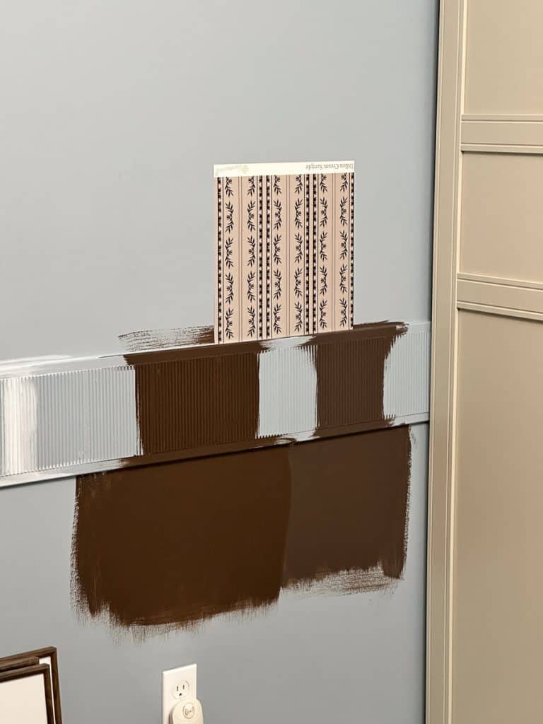
I liked it, so I then took the exact same paint color and purchased a gallon in Sherwin Williams from Lowe’s.
The result, two totally different colors. And on top of that, neither of them looked like the sample chip.
The lesson, always choose your brand of paint before sampling.
Case Study: Samplize Samples
I wanted to fully test the accuracy of Samplize paint samples, so I ordered samples in all the colors in my home (where I used the correct paint brand for the paint color!).
I was surprised to see that the samples were just as affordable, if not cheaper, than buying a paint sample in the store.
Sampling made it easy to compare the top most reliable paint brands like Benjamin Moore, Sherwin-Williams and Farrow and Ball.
I’ve always loved Farrow and Ball paints in images online. I’ve been so curious to see how Farrow and Ball compares to more easily accessible brands. Samplize was an affordable way to do this.
My Take on Samplize
Samplize makes comparing paint colors so easy. I was actually shocked to receive my samples overnight. I wouldn’t have even been able to drive to a store that quickly with my schedule.
Every sample is a substantial size (rather than the tiny paint chips in the stores).
Plus, they are peel and stick so I can easily move the samples around and change positions for different times of day. (You’ll see why that’s important in the next section.)
The extra bonus: I’m not sanding brush strokes from painted on samples before I do my final painting.
Each Samplize sample is painted with two coats of paint (rather than just dyed like the paint samples in the stores.)
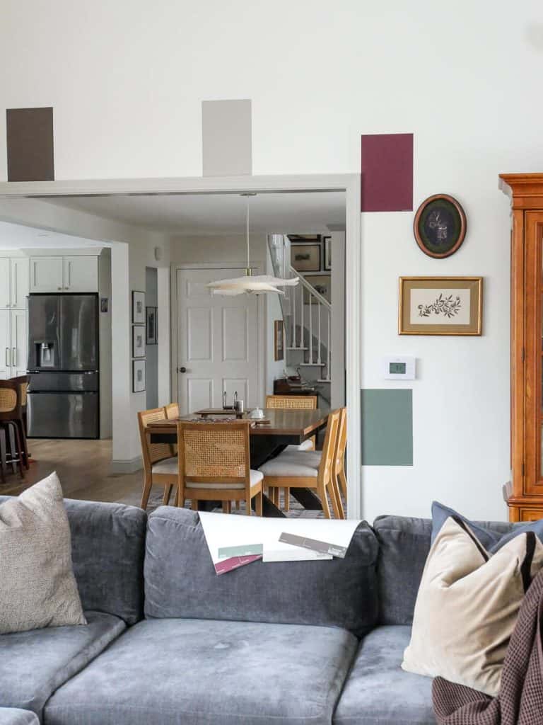
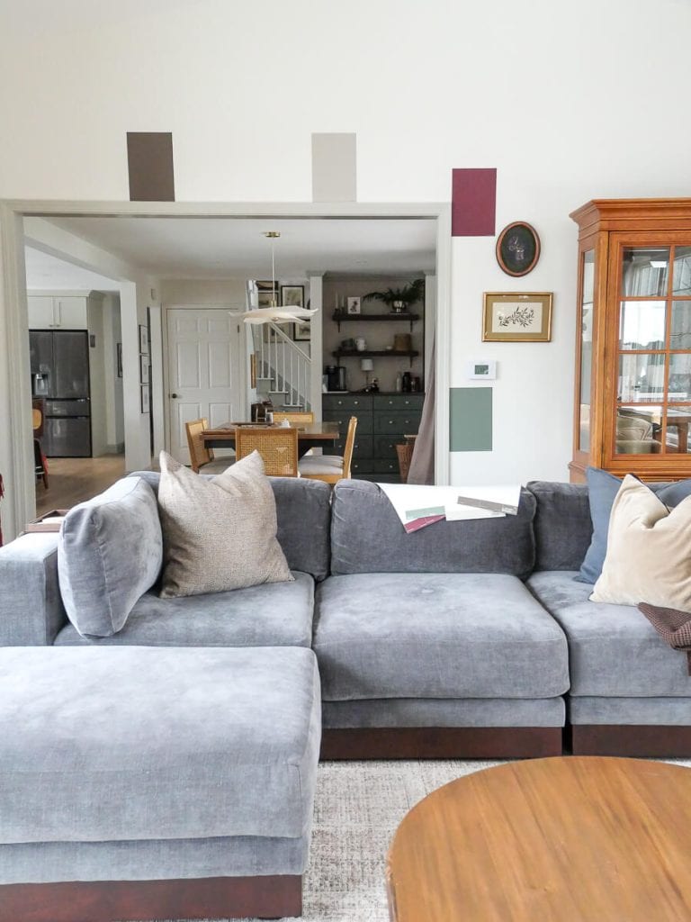
I’ll showcase images of each sample in my real home so you can compare the colors throughout the post.
Can you spot them?
I found Samplize to be an excellent option to get true colors so there are no surprises.
Plus, they are easy to place into a folder and store if you ever want to test them in a new space or move to a new home. This eliminates dozens of paint sample cans to store!
I’ll share more of my experience with Samplize as we continue learning all of the different elements that impact how paint colors look in your home.
Understand How Light Impacts Paint Colors
Lighting changes everything about how paint looks.
Natural light reveals undertones clearly, while artificial light can warm or cool a color. Then, that tone disappears when the lights are off!
Make sure to look at your samples with the lights both on and off to see how your color changes.
You can also change your light bulbs if they are causing your paint colors to become too warm or too cool. I prefer bulbs that are 2700-3000K for main living spaces.
How Directional Lighting Impacts Paint Colors
Additionally, north-facing rooms feel cooler and muted. South-facing rooms are warmer and brighter. East and west light shifts throughout the day, shifting your paint colors with it.
A color you love at noon might feel heavy at night.
Keep these directional elements in mind when sampling. If sampling for a cool-tone north facing room, try choosing colors that have warmer undertones to counteract the natural light. And vice versa for south facing rooms.
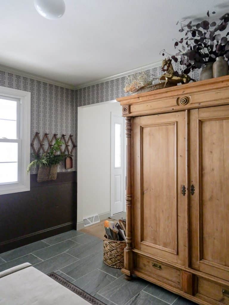
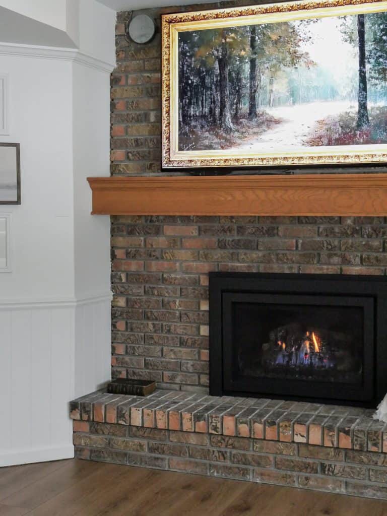
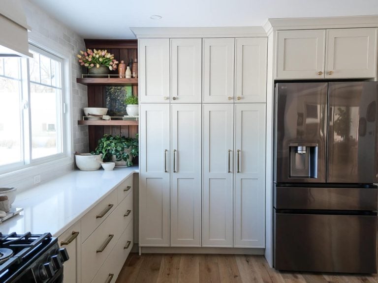
Real Life Example: In my current home, I’ve used Revere Pewter on my kitchen cabinets, main floor baseboards and crown moulding, and basement sitting room walls.
Each room gets different light, and in each space, the paint color looks totally different!
Even within the same home, a single paint color will look different depending on its location. So make sure you’re sampling in the room you’ll be painting.
Seasonal changes also impact paint color. Summer light is warmer and winter light is cooler based on what’s reflecting in the windows from outside. That’s normal, but don’t neglect to take it into consideration.
What time of day will the room you’re painting be used most heavily? Base your sampling off how the paint color looks at that time of day.
Grace in My Space Tip: Always sample paint on multiple walls so you can see how light affects it at different times of day.
Learn to See Undertones Like a Professional
Most paint mistakes come down to not reading undertones correctly.
Warm, Cool, and Neutral—What They Really Mean
Warm paints often lean yellow, red, or beige. Cool paints lean blue, gray, or green. Neutrals still have undertones—they’re just quieter.
Green and pink undertones are the most common surprises. Purple is often a surprising undertone in the grey color family, as well.
Grace in My Space Tip: Compare similar colors side by side—undertones reveal themselves faster when there’s competition.
Why “Neutral” Isn’t One-Size-Fits-All
A neutral that works in one home can feel completely wrong in another. That almost always goes back to the first sections I covered on what you already have in your home, and lighting.
Real Life Example: In my last home, I used white dove on my kitchen cabinets. It pulled warmer undertones because our flooring had a lot of red in it. In our current home, I used white dove on all the walls. It is a much more neutral white in this home because we have very neutral floors and very little warm tones in our furnishings.
Additionally, in the summer time, our last home was fully surrounded by leafed-out trees. In our current home, we have little to no tree cover.
Those green undertones showed heavily in our last home on all our white walls, whereas I don’t compete with green undertones in the summer here.
Same color, two houses, two totally different challenges to consider.
Pick the Right Sheen for Each Surface
Sheen impacts both durability and appearance.
- Flat and matte hide imperfections.
- Satin and semi-gloss reflect more light and are easier to clean.
- High gloss will highlight imperfections the most.
The higher the sheen, the more light reflection, and thus the color can look brighter.
Walls, trim, cabinets, and ceilings all benefit from different sheens. This is my general rule of thumb for each sheen:
- Walls: Satin or eggshell
- Ceilings: Matte or flat
- Trim: Semi Gloss
- Cabinets: Semi gloss or satin
Grace in My Space Tip: When in doubt, a slightly lower sheen usually feels more high-end. Unless you are using high gloss, in which case make sure to hire a professional to get a proper application.
Use Smarter Sampling Methods
Sampling is where most people go wrong. A tiny paint chip gives false security that the color you’re choosing will be reality on whole walls.
Additionally, tiny paint chips can’t truly show you undertones or reflect lighting changes.
Instead, follow this method to ensure that your sampling process lands you on the right color for your space:
- Use large Samplize samples to get the full effect.
- Move your peel and stick samples around the room to capture different light.
- Avoid corners for your Samplize samples, as corners can suck away light.
- Always place your sample next to permanent finishes rather than centered on a wall.
- Test colors for a minimum of a few days to see how they look on sunny days v. overcast days.
- Watch how samples change in morning, afternoon and evening lights.
One other benefit I love about using Samplize is that I have zero risk in sampling.
If I decide I don’t, in fact, want to change the paint color in a room I was considering, I simply remove the sample with no damage.
Had I painted a liquid paint sample on the wall, I’d have to repaint the wall back to the original color.
Or worse, repaint the room anyway if I don’t have the right paint leftover for touch ups!
Why This Method Works in Real Homes
Understanding how paint brands differ, how undertones and lighting impact paint colors, and how your existing finishes can change a color’s appearance is vital to your success!
This professional method removes the guesswork and replaces it with clarity—so choosing paint becomes a thoughtful and methodical decision instead of a stressful one.
If you’re planning to change a color in your space, make sure to follow this process. You can shop Samplize paint samples here.
Why You Should Never Rely on Online Photos
The question I get all of the time is, “Why doesn’t your paint color look the same in my home?”
If you’ve read thus far, I’m hoping you already know the answer! It is likely because my home is facing a different direction, my lighting is different, and that my finishes are different.
Additionally, color comes through a screen much differently than it does in real life.
However, the BIGGEST culprit when comparing online photos to real life, is that those photos have undoubtedly been edited.
Especially professional photography.
All it takes is a click of a button to adjust saturation levels and remove undertones.
For all these reasons, never rely on online images or video to show the true paint color.
Always, always, always sample your colors in your own home.
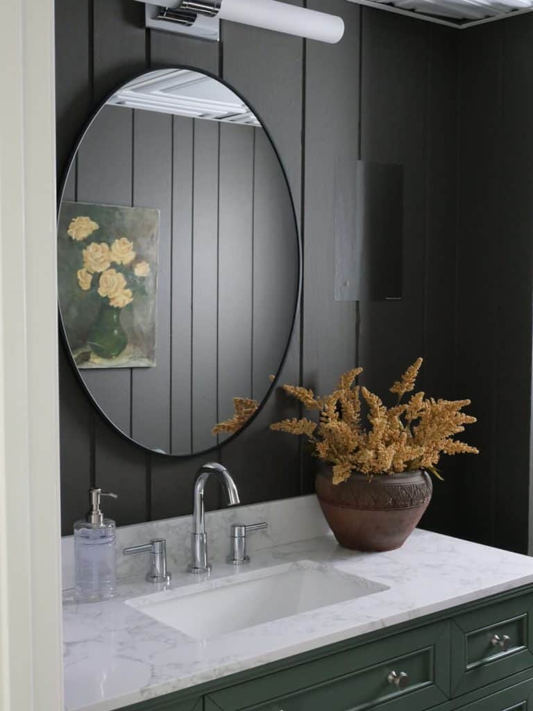
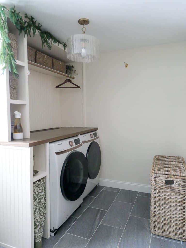
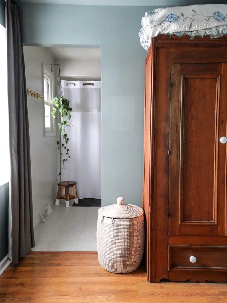
Paint Colors Shown in My Home
Sample them all here on Samplize!
- Kitchen cabinets
- Main living area baseboard and crown moulding
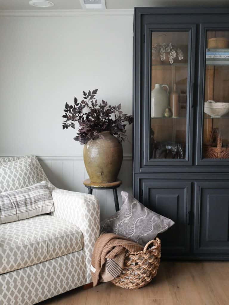
- Basement sitting room walls
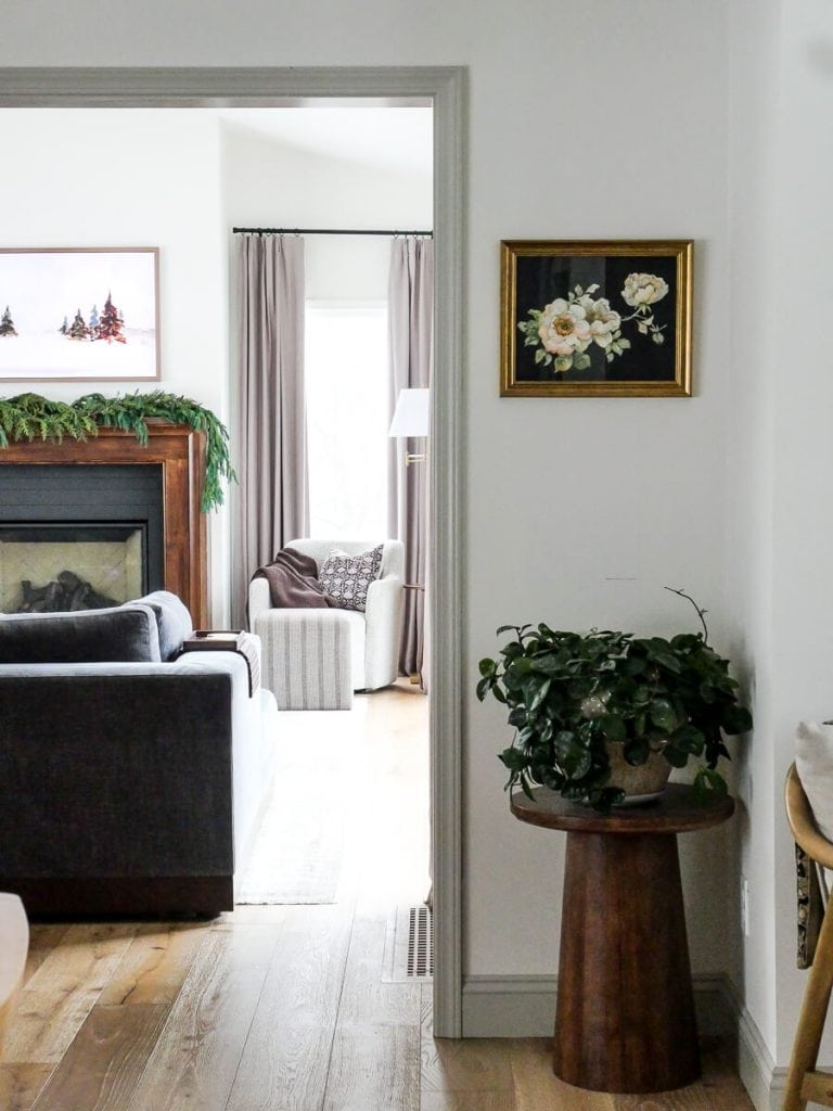
- Main living area walls
- Window trim
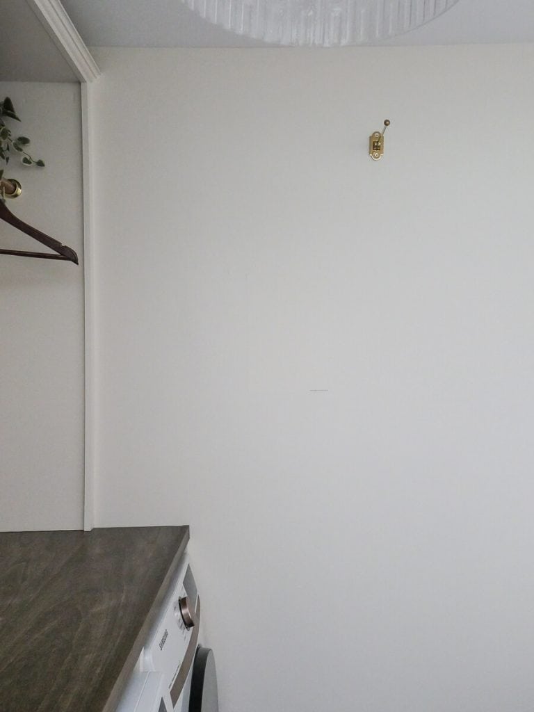
- Laundry/Bath Walls (Satin)
- Laundry Cabinetry (Semi Gloss)
- Bedroom walls
- Mudroom walls and trim
- Bathroom
- Front Door
- Basement walls
- Basement Beadboard
More Painting Resources
If you’re ready to tackle a paint project, I have detailed tutorials for how to paint just about anything in your home. Browse them all here.
Thanks so much for stopping by the blog today. I’d love for you to leave any questions you have in the comments!
Make sure to subscribe to get my Grace Notes directly to your inbox and to access all my insider perks. You can also follow along daily on Instagram and weekly on YouTube!
~Sarah

Sarah, I really enjoy all of your post. I would like your opinion about a guest bathroom remodel. I want to update but don’t really want to gut it. The vanity has a cultured marble top, white ceramic floor tile, and a very light tan tub with the same cultured marble top. Suggestions? I was thinking about changing the vanity to something like quartz, perhaps having the tub professionally refurbished white, more modern white cultured marble? What is your opinion about covering ceramic with a vinyl tile? Thanks. Marjorie