
5 Best Organic Modern Color Palette Combinations
Do you need help choosing a whole home color palette? It can be overwhelming to sort through the thousands of colors across paint brands. So let’s make it simple. I’ve curated the 5 best organic modern color palette combinations that will work in any home.
This post may contain affiliate links for your convenience.
As you read along, if you are looking for any home decor or furnishing sources, you can find them on my Shop Page.
What is the Meaning of Organic Modern?
Before we dive into the best organic modern color palettes, let’s define organic modern design.
What Style is Organic Modern?
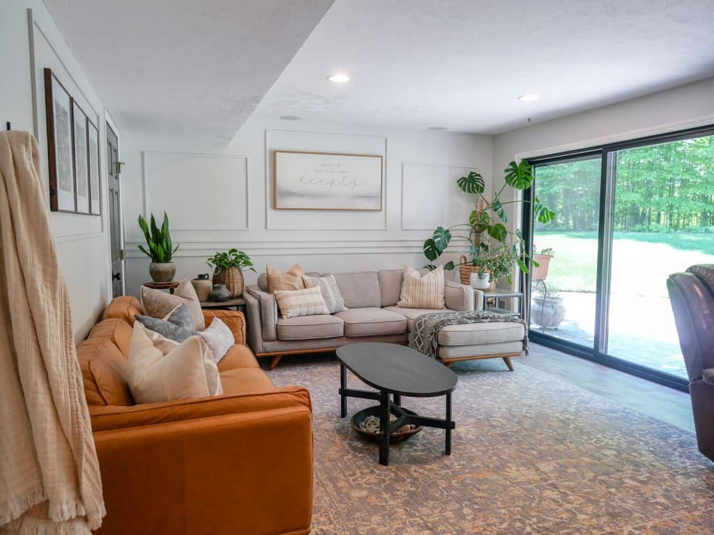
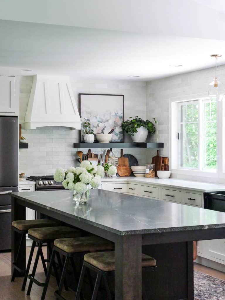
Organic modern design is a beautiful combination of two opposing design styles.
On the one hand, we have modern design. This is typically classified by clean lines, smooth textures, and a neutral and bright color palette.
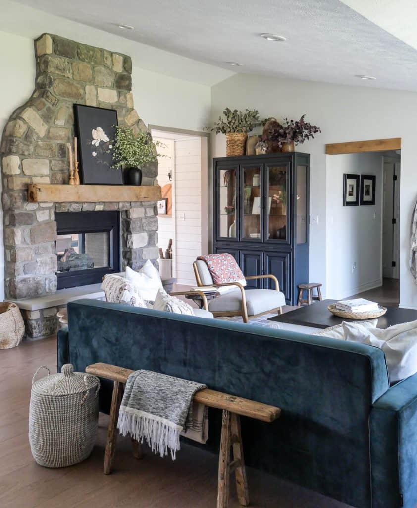
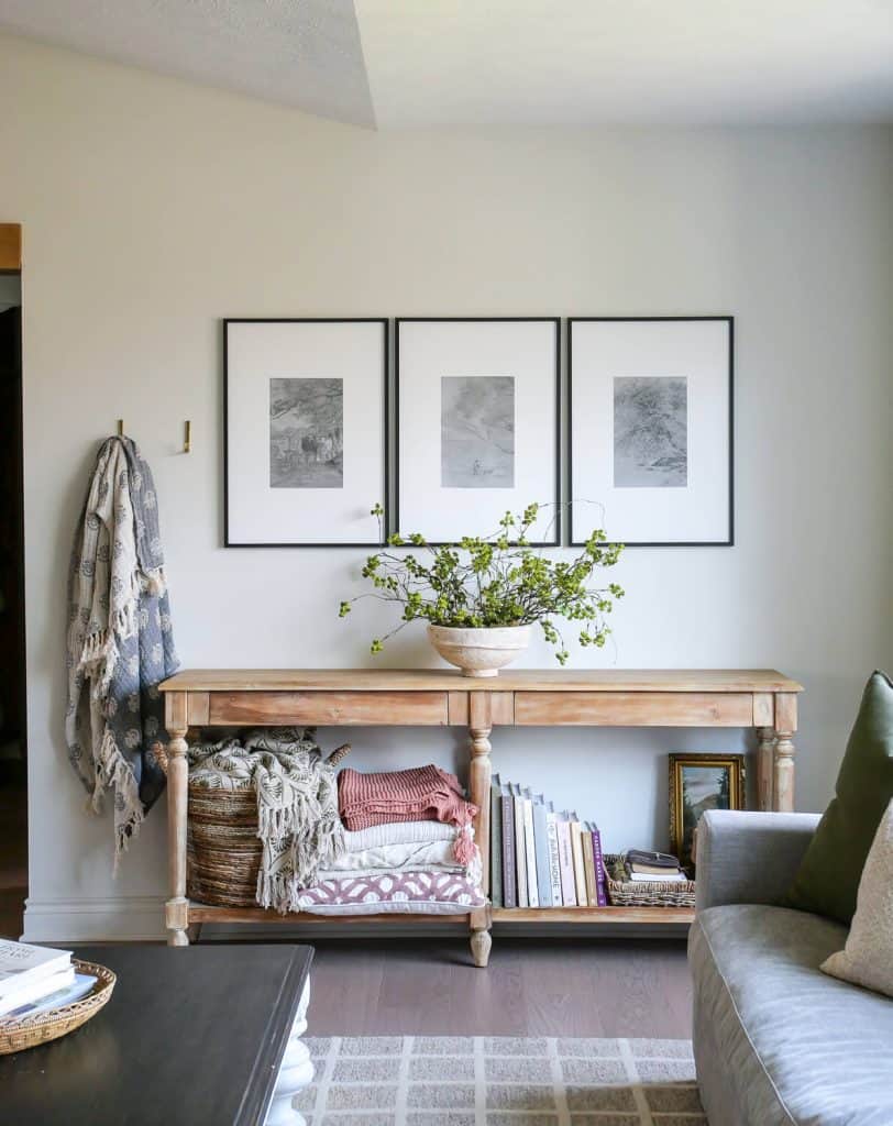
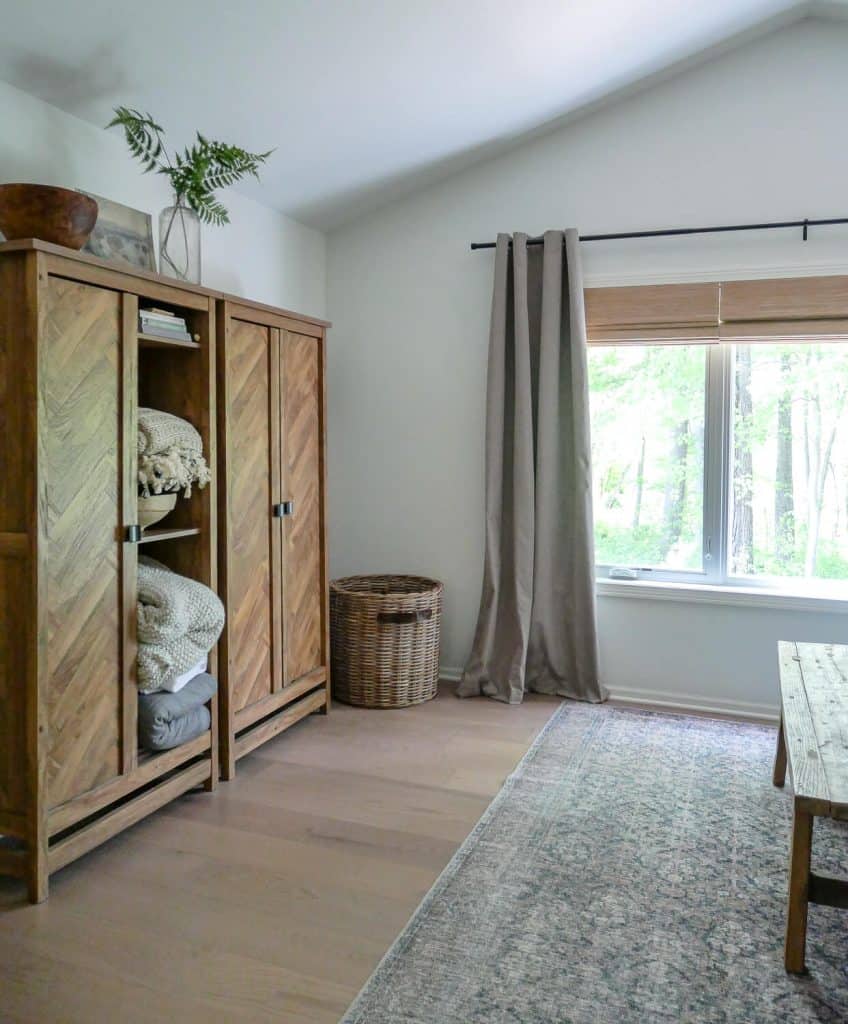
On the other hand, we have organic design. Organic elements are classified by materials that originate in nature. Natural stone, wood materials, leather, and natural fabrics like linen and cotton, can all be included as organic materials.
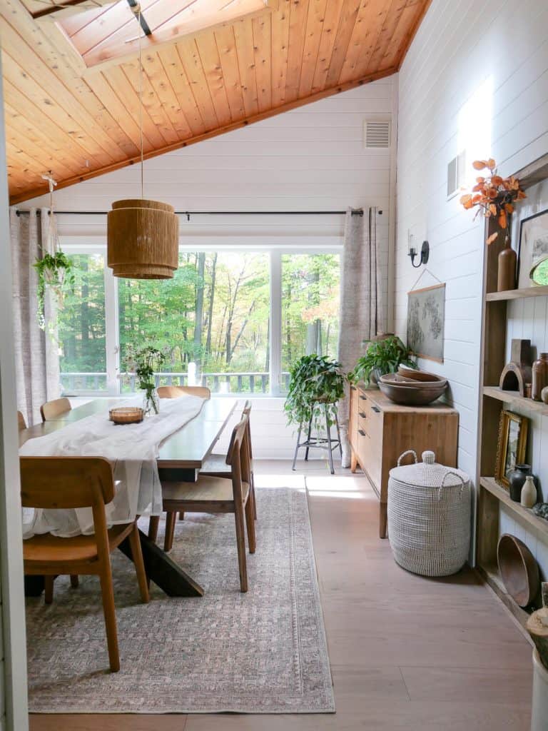
These items are usually more rugged with an ample amount of texture.
The beauty of organic modern interior design is that it combines these two opposing styles to create a modern home that is unpretentious, laid back and cozy.
Is Organic Modern Style Timeless?
Organic modern style is absolutely timeless.
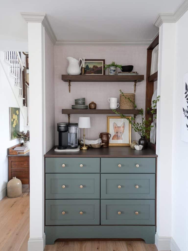
Trim: Benjamin Moore White Dove
Its focus on neutrals and natural elements allows it to stand the test of time. Conversely, because of that focus, it can seamlessly blend and morph into other styles with just a few simple tweaks.
How Do You Style Modern Organic?
Generally, organic modern styles lean more heavily one way or the other. It is best to choose a dominating style that will anchor your overall home design.
You will typically find that most designers lean more heavily on modern styles for architecture. Then, they incorporate organic elements through smaller pieces.
To learn how to fully style your home with modern organic design, read all 12 of my organic modern design rules in this article.
What Colors are Organic Modern?
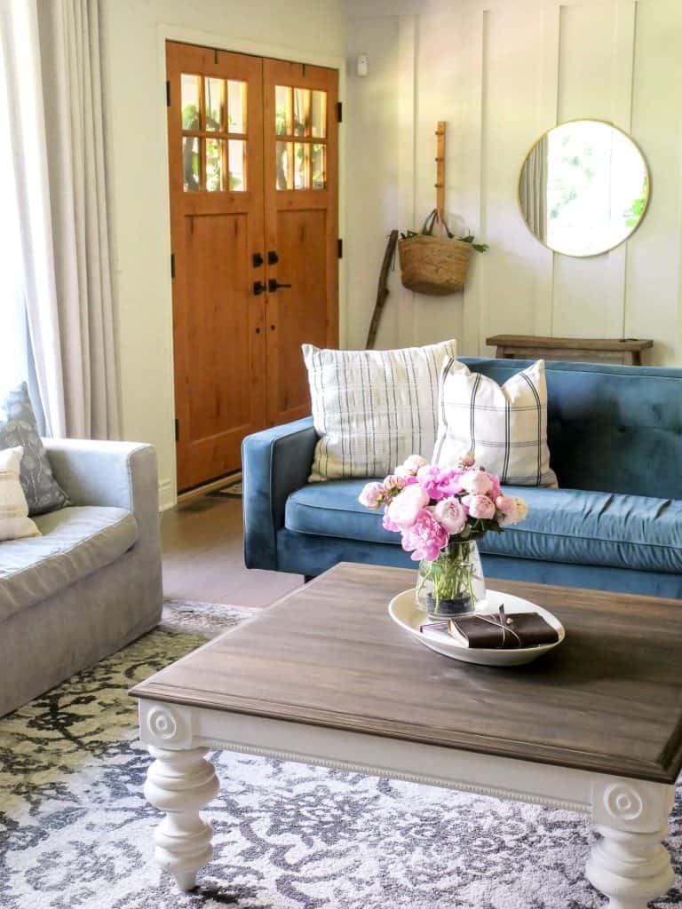
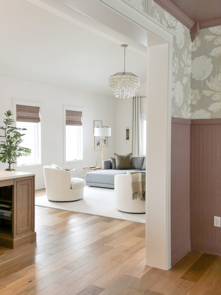
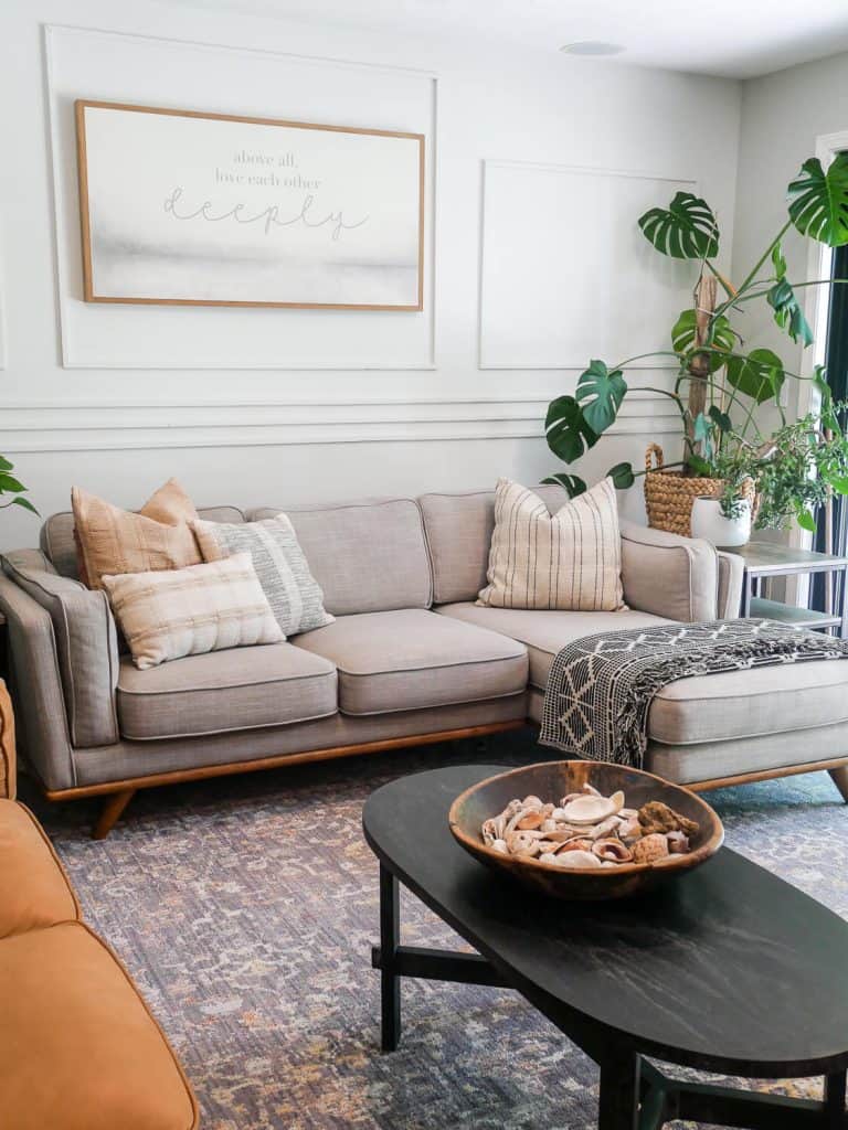
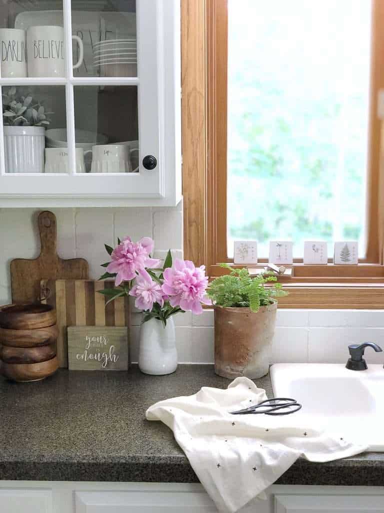
A true organic modern color palette leans heavily on neutrals as the foundation of a room.
- white
- cream
- taupe/tan
- brown
- black
You’ll most often find that walls are painted a white tone while brown is brought in through the use of various wood species. Black is used as a grounding agent.
Most organic modern color palettes then segue into accent colors that are the color of nature.
Most predominant are:
- green
- blue
- dusty pinks
What are the Characteristics of Organic Modern Color Palettes?
While it is easy to throw a bunch of colors together to create an organic modern color palette, it is important to understand what characteristics of the combination make it work.
The general idea is that modern organic design thrives on a wall color that creates space for other elements to shine. This is why we start with a neutral foundation.
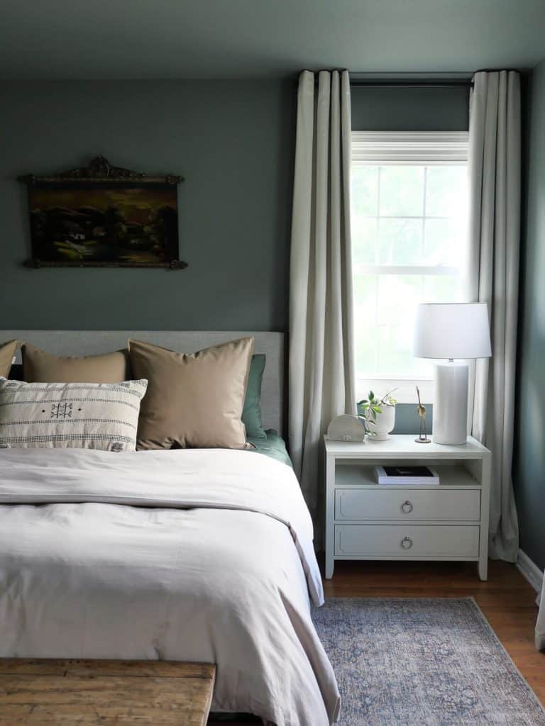
If you go too bold on the walls, it will overshadow the other design elements in the room.
Conversely, if you go bold on the walls like I prefer in bedrooms, then tone down other elements like bedding with neutrals.
Ceiling: Benjamin Moore Stoneybrook
It is all about balance. Let one color steal the show and the others provide visual interest in a variety of ways.
This can be done through decor, textiles, furniture, artwork and area rugs.
5 Best Organic Modern Color Palette Combinations
Now, let’s dive in to my favorite organic modern color palette combos!

I’ve curated 5 combinations that I will share here. But make sure to also sign up to snag my free guide on where and how to use these combinations in your home!
I take the guess work out of which color to use on the walls v. trim v. accents in this free guide.
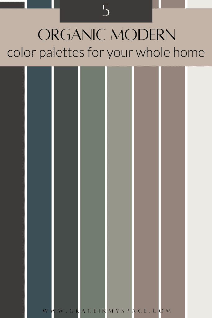
Benjamin Moore Organic Modern Color Palette
Benjamin Moore has some of my all time favorite paint colors.
White dove is a staple I’ve used in every home. I prefer it most on trim and cabinetry.
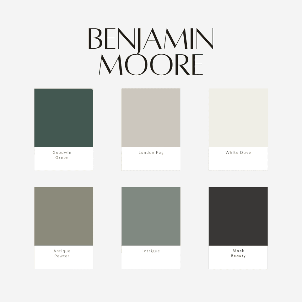
I used Intrigue on my bathroom cabinets in this bathroom remodel.
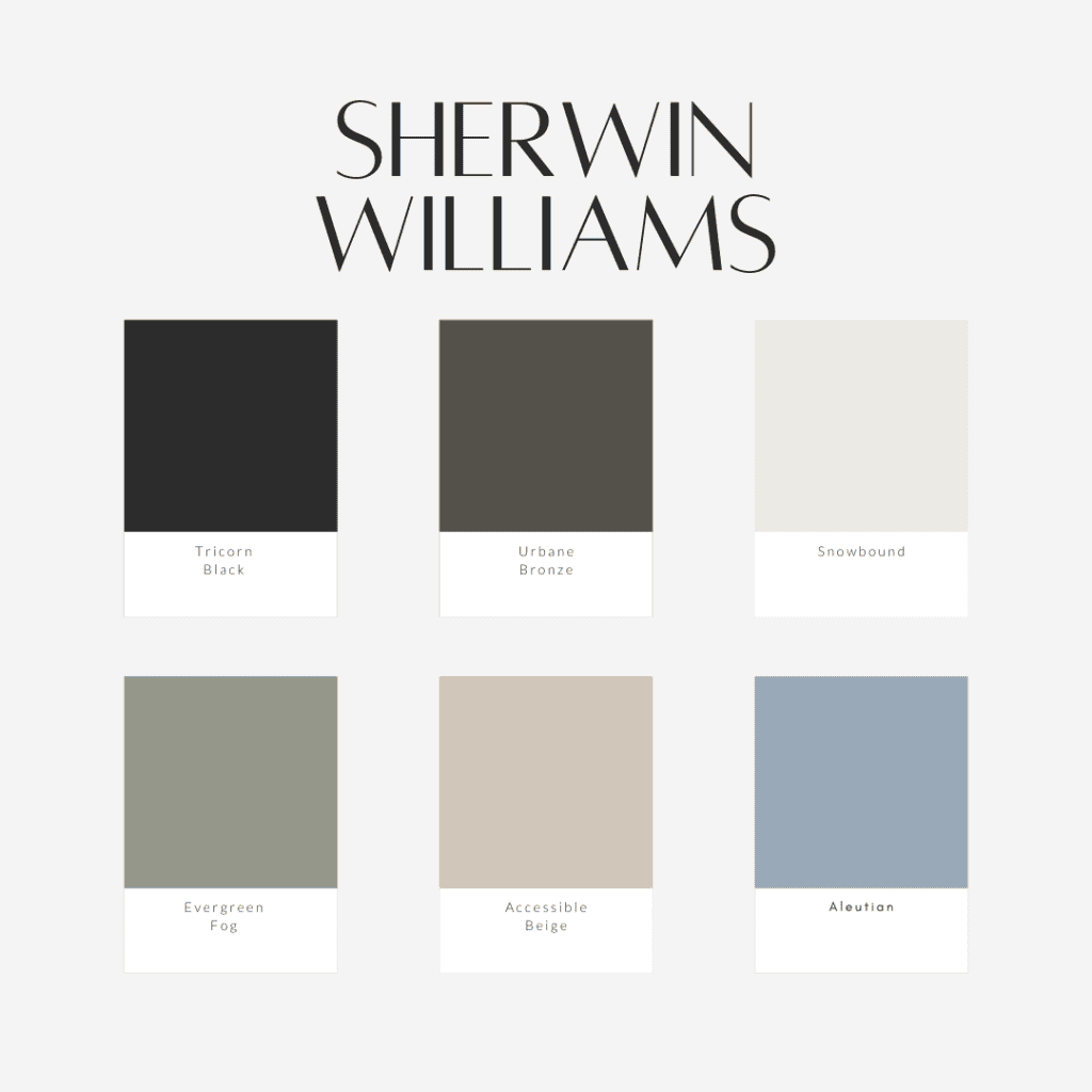
Sherwin Williams Organic Modern Color Palette
Sherwin Williams is also a fan fave.
I used tricorn black and snowbound on our exterior updates. We painted our barn snowbound and I loved how warm it was while remaining bright.
Additionally, I’ve used urban bronze on my interior doors on several houses. I love the warm drama it adds without being straight black or grey.
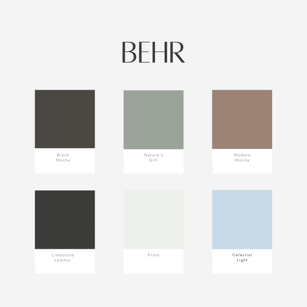
Behr Organic Modern Color Palette
Behr has some beautiful soft colors. I used black mocha on my last bathroom vanity DIY and I love the brown undertones.
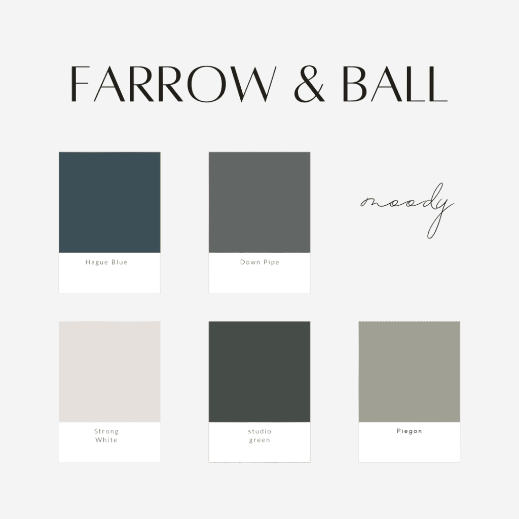
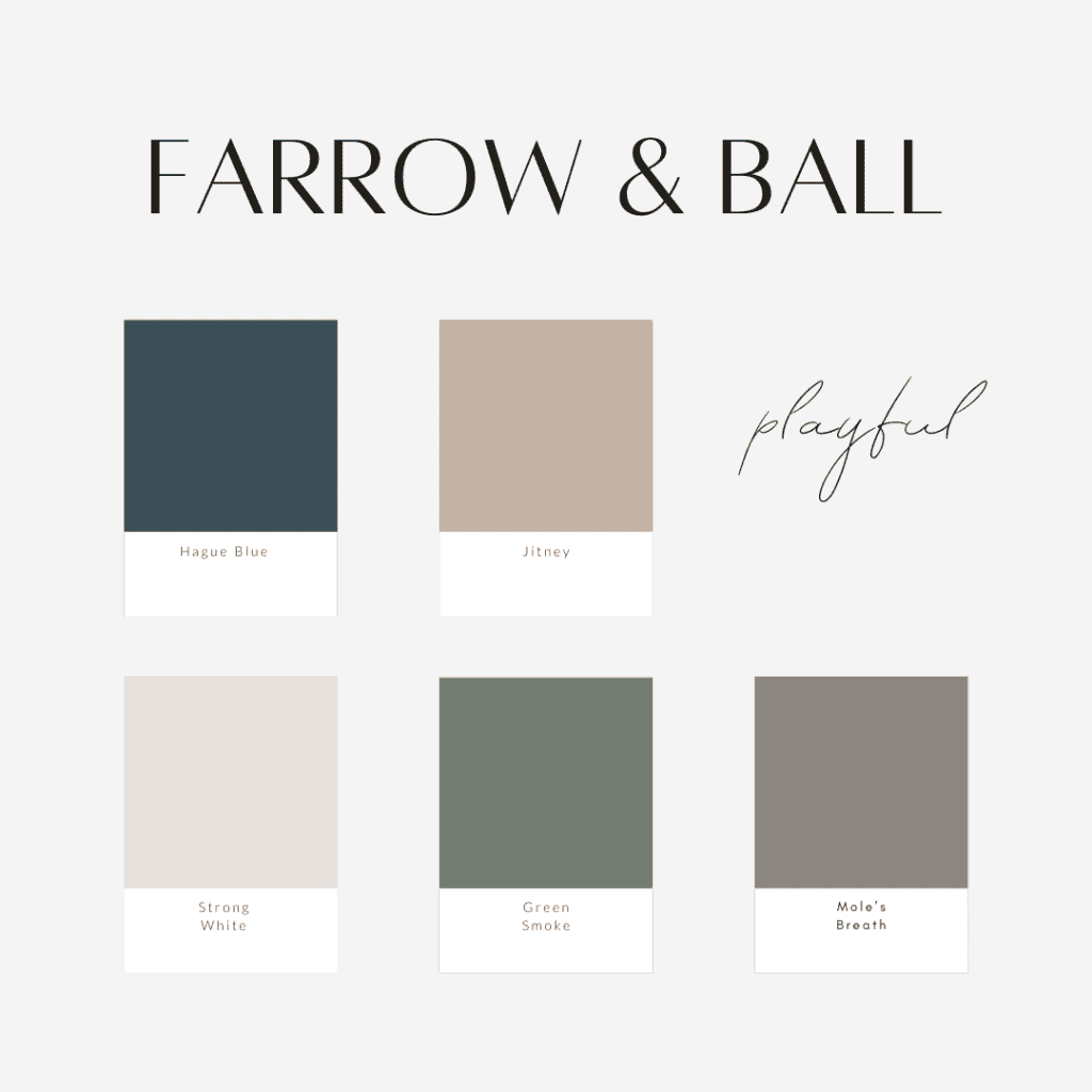
Farrow & Ball Organic Modern Color Palette
Farrow & Ball has such rich and saturated colors. Down Pipe has been on my list to use for quite some time.

How to Choose Paint Colors The Right Way
Before you head to the store and buy gallons of paint, I need to caution you on the right way to choose paint colors.
Trim: Behr Perfect Taupe
While the colors I’ve curated have proven to be winners, they will not look 100% identical in your home as they do online, or even in someone else’s home.
5 Factors to Consider When Choosing Paint
That is because there are quite a few factors that play into how a paint color looks in each room. These are the top five to consider.
- Lighting (natural and artificial)
- Paint undertones
- Surrounding colors (white is notorious for picking up the undertones of surrounding colors)
- Color matching from brand to brand
- Specific machine your gallons were mixed in
If you’ve ever taken a paint sample from the store and found it looks totally different in your home, lighting is likely the culprit. Harsh store lighting will reflect differently than your home’s lighting. The amount of natural light you have will also greatly impact your color palette.

Cabinet: Black by Rustoleum Studio Color from Walmart
Undertones also play a large role. Whites and greys are notorious for having purple or blue undertones you don’t expect. I like to hold a sheet of white computer paper up to my sample. This reveals undertones very quickly.
Another thing to consider is color matching from brand to brand. For example, when I painted our last home dark grey, I chose Benjamin Moore Graphite. However, the paint company used Sherwin Williams paints.

They color matched. I color matched my sample. We all color matched differently and the result was a disaster. Head to this article to see what a difference it made to color match from brand to brand!

Finally, choose a store to buy your paint from and keep going back to that store. Each machine is calibrated a certain way. Even a slight difference in calibration can change the color outcome. This is especially important for touch up paints and when you run out of paint before a job is finished.
So keep these factors in mind when choosing your paint color!
My top recommendation: buy an actual sample from the store you will purchase from, in the brand you will purchase, and paint it on the wall. Wait to see how the light changes the color from morning to night to ensure that you love it.
More Painting Resources
Don’t forget to pin this for later!
Thanks for stopping by the blog today! Make sure to subscribe to get my Grace Notes directly to your inbox and to access all my insider perks. You can also follow along daily on Instagram and weekly on YouTube!
Learn more painting resources in my DIY painting archives or via the articles below!
~Sarah


Absolutely love the focus on organic modern colors! It’s so refreshing to see such thoughtful and stylish combinations. I’m particularly excited about trying out the earthy tones suggested here. They seem perfect for creating a cozy yet contemporary atmosphere in my home. Great job!
This sounds incredibly helpful! Choosing a whole home color palette can be so daunting, especially with the organic modern style. I’m excited to see these 5 best combinations that are promised to work in any home. Can’t wait to check them out for my next project!
Yeah. So beautiful. I like it!
I love this design. I hope that I have house with this design.
Well nice color pelettes pairing… @Sarah
Btw I’m playing around with palette wheels. Do you have any tips to make out of it?
Reading this article was like unlocking the secret to painting happiness on my walls! Who knew choosing colors could be so stress-free and fun? Now my home is rocking that organic modern vibe, and I’m officially a color palette pro. Thanks for turning my paint-saster into a masterpiece, Sarah!